Content as an Instrument of Inquiry
Author: Michael Feldstein
Go to Source
If you’re not writing clearly, then you’re not thinking clearly.
Mrs. Galligani (My high school English teacher)
In response to the posts so far in the series, John P. Mayer, Executive Director of the Center for Computer-Assisted Legal Instruction (CALI) tweeted,
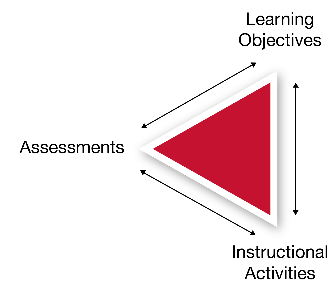
In the first post of the series, I explained the basic logic of the content design pattern to which John is referring:
- Start by articulating what you are trying to help students to learn as clearly as you can.
- Then figure out how you are going to be able to tell (or “assess”) whether the students students have, in fact, learned what you are trying to help them learn. Again, be as clear and explicit as you can in this.
- After you have taken the first two steps, then design learning activities—reading, watching, discussing, experimenting, and so on—that you believe will help the students to learn what you are trying to help them learn.
- As you design these activities and the content that makes it possible (e.g., readings for the reading activity), be sure to embed little low-stakes exercises throughout so that you and the students can track their progress toward learning whatever it is that you are trying to help them to learn. And, if necessary, to adjust the teaching or learning strategies.
It’s not exactly rocket science.
In the second post, I showed that we could derive pedagogical benefit when we formalize this content design pattern in digital curricular materials. If every bit of content and every assessment item is labeled with a particular learning objective (or learning goal), then we can track various kinds of student progress toward that learning objective. Have they started any activities related to that learning objective yet? Have they finished them? How well are they scoring on the assessment measures for that particular learning goal? How are they progressing through the stack of learning objectives that make up a larger curricular unit? Are any students stuck on one particular goal? Is the whole class stuck? We can get clearer answers to these questions, for ourselves and for our students by creating well-crafted curricular materials in the design pattern that I described above and creating very simple software capabilities for showing how students are performing on the assessments. Call this much “analytics” is a stretch. Statistical algorithms are optional and often superfluous to get us this far. We’re really just colating and visualizing the student activities and assessment results in ways that the content design enables us to do. In tech speak, we would call these “dashboards” and “visualizations” for the “data.” But your paper grade book (if you still use one) is a dashboard for the same data in a somewhat similar way. Honestly, once you throw in grading on curves, different point schemes, dropping the lowest score, and so on, some instructor grade books are algorithmically more complex than many of the courseware affordances I showed in my last post.
The value of having many examples
So far, I have been writing about the content design pattern as a tool for getting the most out of self-study curricular materials. That is still a good frame of reference for thinking about courseware or courseware-like content as static tools for teaching. But this content design pattern also has great value—in the long run, perhaps greater value—as a tool of inquiry for educators who want to improve their teaching craft.
And this is the moment where I reveal my not-so-hidden agenda.

If you thought this series was about courseware, then you were (mostly) wrong. If you thought this post was going to be about machine learning and algorithms and adaptive learning, then you were also (mostly) wrong. I will touch on those topics, but they are means to an end.
And that end is to talk about increasing literacy and fluency among faculty in evidence based, digitally-enabled pedagogy. Just as the proliferation of commercial courseware provides us with a wide range of examples of professionally designed content which we can study to learn more about trends in curricular materials designs, the proliferation of analytics and adaptive learning provides us with an increasingly wide range of examples of professionally constructed analysis and inference techniques which we can study to learn more about current trends in such techniques.
We have an ever-growing library of implementations—good, bad, and ugly—which educators could be studying and learning from if only the pedagogical design and function were not either opaque or invisible to them. Forget about the products as products for a minute. Set aside your feelings about the vendors for a moment too. We have a digitally-enabled or enhanced teaching design patterns that have been evolving for at least 40 years. We are now are at a point where those patterns have reached critical mass, are proliferating at a rapid rate, and are being employed by academic and commercial course designers alike.
Somebody should tell the faculty, don’t you think?
The Empirical Educator Project (EEP) is going to undertake a major literacy effort to help increase awareness, literacy, and fluency in this design pattern, aided by some of the tools that Carnegie Mellon University has made available as part of OpenSimon and by the efforts of the wonderful people and organizations in the EEP network. I’ll have more to say about these efforts in the coming weeks. but for now, I am using this series to explain why I believe this is a fruitful area for educator literacy efforts.
And it ain’t just about building a better textbook.
Pedagogy as hypothesis
Have you ever had one of those days where your carefully crafted lesson doesn’t go the way you thought you did? If you haven’t, then either you haven’t taught much or you’re doing it wrong. Because, given sufficient time in the classroom, every self-aware educator is going to have this experience. Something that you thought would be easy for the students turns out to be hard. An explanation that you thought was crystal clear confuses them. You thought the students were following along great until they bombed the unit test.
In the classroom, most educators experience these problems and make adjustments as needed. They may not test for these problems programmatically. They may not conduct formal experiments to fix problem spots in their courses. But many, many educators do this in some form to some degree. Whether consciously or unconsciously, deliberately or instinctively, they are teaching by hypothesis. They think something will work, test it, and if they are wrong, they will try something else. Teaching isn’t assembly line work. It’s knowledge work. Done right, it requires an endless amount of creating problem-solving and tinkering.
In the days of analog textbooks, it was a lot harder to do this kind of tinkering with student self-study work because educators were mostly blind. They couldn’t see what students were doing and they often didn’t even get to directly observe the results. They almost never got a chance to create a rapid feedback cycle with individual students to try a few different things and see what works. That changes with digital—if you have the right content design.
As with the last post, I’m going to show some examples from Empirical Educator Project sponsors to show this content design pattern makes new teaching insights possible in a digital environment.
Is your content working?
Suppose you want to find out if the content in your digital curricular materials is actually helping students to learn what you are trying to help them learn. You could look at page views and other Google Analytics-style information to see what content students are spending time on. And you could look at the assessment scores. Take a moment and think about what you could learn from those two pieces of information.
Eh, not much.
Now suppose your curricular materials were created using backward design. For each content item, you know which assessment questions it is designed to prepare students for and which learning objective it is ultimately designed to teach.
You now have the ability to link page views to assessment data (and both to learning goals). Did your students spend a lot of time on a piece of content and still perform poorly on the associated assessments? Then something probably wrong with your design. Did they score well on the assessments while skipping over the associated content? Again, there’s a potential opportunity for improvement.
What I’ve just described to you is the essence of the RISE framework, which was developed by Lumen Learning. As I described in a previous post, Lumen worked with Carnegie Mellon University to integrate RISE into one of CMU’s open source learning engineering tools. Now, anyone using any platform that can export data about page views and assessment items that are associated with a particular learning objective can generate a simple graph with page views on one axis and assessment performance on the other. It’s a simple and intuitive tool that any educator could use to get insights into whether their curricular materials are as effective as they could be. At last spring’s Empirical Educator Project (EEP) summit, Lumen and CMU demonstrated this process working using content from D2L Brightspace.
Here’s a panel discussion we had about RISE and CMU’s OpenSimon LearnSphere at the EEP summit:
Note that the content doesn’t fix itself through the magic of machine learning. Rather, RISE helps educators focus their attention on areas of potential improvement so that the humans can apply their expertise to the problem. This is true even in the most sophisticated commercial products. However fancy the algorithms may be, behind the scenes, experts are using the data to identify problems that still require humans to solve.
Publishers that really understand the digital transformation have subject-matter experts who are pouring over the data and making changes on a regular basis. When Pearson announced that they would be moving to a digital-first model so that they could update their products more frequently I wrote,
[I]n the digital world, there are legitimate reasons for product updates that don’t exist with a print textbook. First, you can actually get good data about whether your content is working so that you can make non-arbitrary improvements. I’m not talking about the sort of fancy machine learning algorithms that seem to be making some folks nervous these days. I’m talking about basic psychometric assessment measures that have been used since before digital but are really hard to gather data on at scale for an analog textbook—how hard are my test questions, and are any of the distractors obviously wrong?—and page analytics on the level that’s not much more sophisticated that I use for this blog—is anybody even reading that lesson? Lumen Learning’s RISE framework is a good, easy-to-understand example of the level of analysis that can be used to continuously improve content in a ho-hum, non-creepy, completely uncontroversial way.
It would be irresponsible for curricular materials developers not to update their content when they identify a problem area. It would be like continuing to give a lesson in class when you know that lesson never works. But the main point here is that the software helps the human experts perform better. It doesn’t replace them.
Are your assessments working?
Just because students are looking at a piece of content and still scoring poorly on the related assessment items doesn’t necessarily mean that the problem is with the content. What if the assessment questions are bad?
Psychometricians developed statistical methods for evaluating the quality of assessments many decades before the advent of digital courseware. The term of art for the most widely used collection of methods is “item analysis.” Item analysis tools have been built into most mainstream LMSs for quite some time. (If I recall correctly, ANGEL was the first platform to do so.) Here’s an example of an item analysis graph from Brightspace:
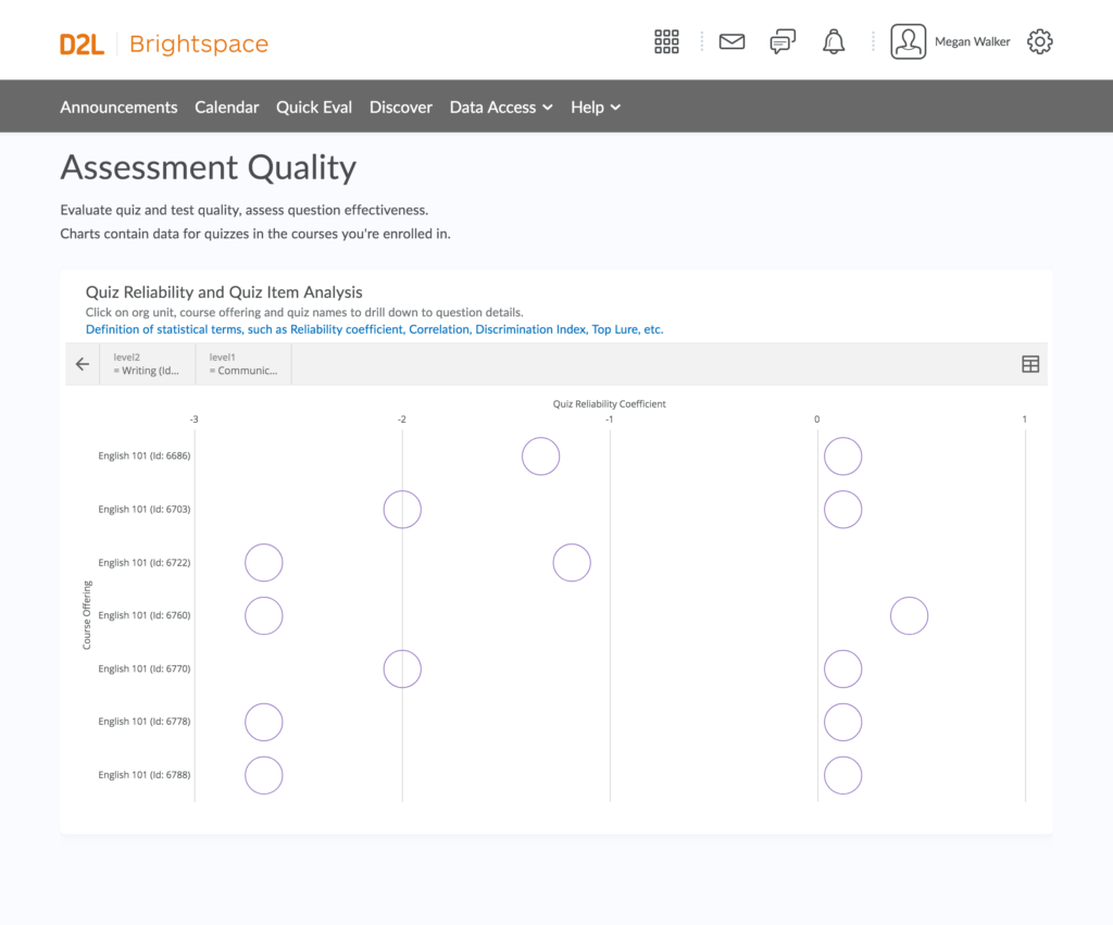
This particular visualization is showing the results of something called a “reliability coefficient.” It tells you how consistent the student answers are to questions within an assessment. I’ll ask you again to think for a moment about how useful that measure would be by itself.
Now think about how useful it would be to see how consistent student answers are to questions about one particular learning objective. The more interrelated questions are within a group of questions being evaluated this way, the more consistent the student responses should be. If all of the questions assess mastery the same learning objective, then performance across those questions should have a fairly high degree of internal consistency. Yes, some questions may be harder than others. But there should be an overall pattern of consistency among the student answers to questions assessing the same learning goal. If there isn’t, then there may well be something wrong with the assessment.
And speaking of difficulty, item analysis does provide the ability to assess the difficulty of questions relative to each other. When you design questions to assess a learning goal, you may deliberately write some questions that you believe will be trickier than others. But you may not always be right about that. Sometimes students can get tripped up by the design of question, making it more difficult than you anticipated. Or maybe you unintentionally gave a clue to the answer in the design of your question. Or maybe there’s nothing wrong with your individual questions per se, but the overall difficulty of them for one learning objective is higher than it is for the others in the unit. Or lower. Wouldn’t you like to know those things? Well, you can. Your LMS probably has the tools to help you learn these things about assessments within the LMS. But those tools are a lot more useful if you have grouped your assessment questions by learning objective.
Are your learning objectives working?
Maybe the reason that the students are struggling isn’t because your content is confusing, or because your assessments are poorly designed, but because the learning goal you’re assessing isn’t as well defined as it could be. Sometimes you discover that what you think of as one skill actually contains a second skill or knowledge component that you take for granted but that is tripping students up. Here’s how Carnegie Mellon University professor Ken Koedinger puts it:
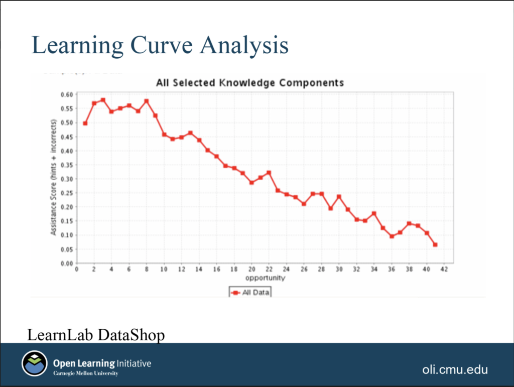
If you have that problem, then there should be evidence in the assessment data. Students who are taking well-designed assessments that cleanly assess one learning goal should show improved performance on assessment questions over time as they progress toward mastery. Here’s an example of what Carnegie Mellon University calls a “learning curve,” showing exactly that trend in student performance in their OLI platform:
But what if your learning curve looks like one of these?
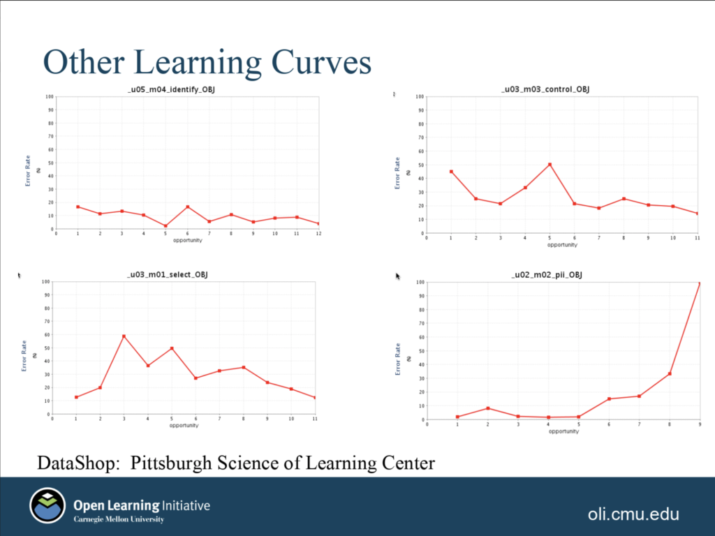
See the blip in the graph on the top right? That could suggest that one or more questions snuck in that test something other than just the intended learning objective. (Or they could have been poorly written questions.) The graph on the top left, on the other hand, may show that students have already mastered a learning objective, or that the questions are two easy. If you take some time to look at each of these graphs, they may suggest different questions to you about your curricular materials design. All of this is possible because assessment questions have been linked to learning objectives in the content design. And again, the solution when one of these anomalies appears is generally to have a human expert figure out what is going on and improve the content design.
Are your scope and sequence working?
Implicit in that last section is the notion that it’s possible for even good, experienced educators can miss prerequisite skills in their course designs from time to time. Very often, the algorithms behind skills-based adaptive learning platforms are testing for missing prerequisites. In the marketing, the emphasis is placed on the software’s ability to identify prerequisite skills that individual students may have missed along the way. But it’s important to understand what’s going on under the hood here and how it affects the content design and revision of these products by the human experts. One of the things that this type of adaptive software is really doing is finding correlations between students doing poorly on one skill and them doing poorly on prerequisite skills. In some cases, the prerequisites are well known by the content designers. In those situations, the software is checking to see if the student is struggling on a lesson because she needs to review a previous lesson. In these cases, the “adaptive” part of adaptive learning means that the system automatically provides students with opportunities to review the prerequisite lessons that they need to brush up on.1
But sometimes the software identifies a correlation between a skill and a previous skill that either the content designers weren’t fully aware was a prerequisite or did not realize how important of a prerequisite it is. The analysis shows that students who struggle to learn Skill F, perhaps surprisingly, often didn’t do so well with Skill B.
Unfortunately I don’t have any screen shots illustrating this—maybe somebody reading this will send me one—but it’s an easy enough idea to grasp. And once again, the algorithms that drive this analysis only work when content is designed such that assessment questions are tied to specific learning objectives.
Is your classroom pedagogy working?
Now I’m going to explore a theoretical affordance made possible by this content design pattern. It’s not one that I’ve seen implemented anywhere. But we can get the outlines of it by looking at Pearson’s efficacy report and educator guide for their Revel psychology product. (Reminder: Pearson has paid me to consult for them on how to make their efficacy reports, including this one, as useful as possible.)
One of the main efficacy measures in Pearson’s study was, essentially, the size of the improvement students showed from their formative assessments to their summative assessments. This was measured in a class where a professor was implementing specific pedagogical practices that are often lumped together under the heading “flipped classroom.” Teasing this out, we would expect students to experience some benefit from the formative assessments and the curricular materials themselves, and some benefit from the professor’s teaching practices that helped students take maximum advantage of what they could learn about their progress from their formative assessment performance that the courseware was giving them.
Let’s think about the performance improvement measured in this study as a kind of a benchmark. It shows how much of benefit a class could experience given a particular set of teaching practices and students that tend to take that sort of class in that sort of university using that particular curricular materials product. What you might want to do, as an educator who is interested in active learning and flipped classroom techniques, is evaluate how much of an influence your classroom practices have on the benefit that students can extract from the formative assessments of the product.
If both the formative and summative assessments are tagged with the same learning objective, then it should be possible to give every instructor with a gauge like the one that Pearson had to create in order to measure the impact of their product under close-to-ideal conditions. But we’d be flipping the analysis on its head. Rather than controlling for the teaching methods to measure the impact of the content, we’d be controlling for the content in order to measure the impact of different teaching methods. Instructors could try different strategies and see if they increase the benefit that students can get from the formative assessments.
Yet again, this possibility for creating innovative “learning analytics” is becomes apparent once you do some hard thinking about the simple content design pattern and all the different kinds of insights that you can extract from implementing it.
For the techies reading this, the lesson is that the value of educational metadata generated by human experts for the purpose of supporting their own thinking will exponentially increase the potential for your machine learning algorithms to generate useful educational insights. By itself, even the most sophisticated machine learning techniques will have sharply delimited applicability and severely limited value in a semantically impoverished environment. My favorite high school English teacher used to admonish, “If you’re not writing clearly, then you’re not thinking clearly.” Something like the inverse could be said for learning analytics. Clear writing is not evidence of clear thinking but rather the prerequisite for it. If the content authors do not provide the algorithms with indications of pedagogical intent, then the algorithms will not have the cues they need to make useful inferences. If content is infrastructure, then content metadata is architecture. It is a blueprint.
For the educators in the audience, I hope it’s clear by now that this design pattern, which is ubiquitous in commercial digital curricular materials and quite possible to implement in platforms like LMSs, is something that educators need to be aware of and understand. We have a literacy challenge and a fluency opportunity.
The opportunity before us
In the coming days and weeks, I will be sharing details of several major initiatives from the Empirical Educator Project related to this challenge and opportunity. I haven’t even shared them with the EEP network yet because I am in the process of nailing down a few final details right now. But I am very close to nailing down those details. So close, in fact, that I expect to be able to share some of them with the public in the final installment to this series.
Stay tuned.
But also, y’all don’t have to wait for me or EEP. Many of you have deep expertise in this content design pattern and what can be done with it already. I’ve found that my biggest challenge in trying to talk to experts about this challenge is that they so take for granted the concepts I’ve been outlining in these last three posts that it’s hard for them to even think about them as something to be discussed and explored. I hope that this series has clarified the need for and value in talking about the content design explicitly. When we talk about the value of digital content in terms of algorithms and data and functionality and other digital terms, it is easy for educators lose the thread. But when those conversations are grounded in the design of content and courses and pedagogy, then the digital accoutrements become embodiments of teaching strategies that make sense to them and that they can think about critically as experts.
More of that, please.
- This is not the only way that adaptive learning products can work, but it is a common approach.
The post Content as an Instrument of Inquiry appeared first on e-Literate.