Managing the E-Learning Course Theme Colors
Author:
Go to Source
When someone first starts to build an e-learning course, one of the first things I recommend is determining the colors they’ll use. And from there, create a template and assign the theme colors.
The benefits to theme colors is that they allow consistent use of colors throughout the course; and if one needs to change, it can be changed once, and that change is applied wherever the color is used.
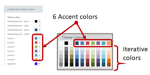
The next recommendation is to determine how to use theme colors. This is often confusing because, you get six theme colors and five derivatives per color. However, there’s no rhyme or reason in terms of how they should be used. They’re just six boxes that can be filled with colors. You can use those boxes anyway you like.
But that’s not how you should use them.
I recommend that you define a theme color structure and then use them consistently. This way, every time you build a course the theme colors are set up the same and you can easily swap them out when needed.
How to Set Up Theme Colors
Here are a few ideas that may work:
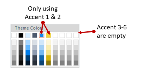
- You get six theme colors. But you don’t really need to use all six.
- Define how you do want to use the colors, whether it’s six or four or two.
- Use theme colors consistently in all templates you create.
- Courses usually have a main color and an accent color. If you only used two colors, you’d have twelve to use because of the iterations. That may be all you need.
- Most courses have some positive and negative feedback color, usually green and red. Use two of the theme colors for positive and negative feedback.
Here is one way you could define your theme colors:
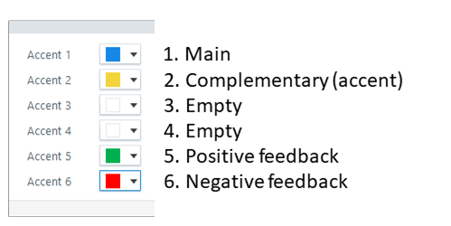
- Accent 1: base color. Usually this is your core brand color.
- Accent 2: accent color. Most brands have an accent color. If you don’t have one, you can use a color theme site to create one. I typically will select a complementary color of the base color.
- Accent 3: open. Why create a color you don’t need?
- Accent 4: open.
- Accent 5: positive color. Green pulled from the base color’s palette. Use this for quiz feedback or icons to show a good decision.
- Accent 6: negative color. Red pulled from the base color’s palette. Use this for quiz feedback or icons to show a wrong decision.
For the two open colors, I may look through my organization’s web site and marketing collateral and see if there are other secondary colors used that I could add to the palette. Most of the times, two colors are all I need.
If every course is built with consistent use of theme colors, they can be swapped in seconds. This is a critical part of building and re-using interactions and templates. It’s a little more work upfront (which should be done anyway). But in the long-term it offers some time-saving benefits.
Do you have a strategy when using theme colors?
Download the fully revised, free 63-page ebook: The Insider’s Guide to Becoming a Rapid E-Learning Pro
Upcoming E-Learning Events
- October 6: Amsterdam. 10 Production Tips from the E-Learning Challenges by David Anderson. Register here.
- October 21: Sydney. 3-Hour Articulate Virtual Event: 10 Production Tips from the E-Learning Challenges, Creating Engaging Software Training in Rise 360, and more. Register here.
- October 29: ATD Nashville. Here’s Why You Need an E-Learning Portfolio.
Free E-Learning Resources
 |
 |
 |
|
Want to learn more? Check out these articles and free resources in the community. |
Here’s a great job board for e-learning, instructional design, and training jobs |
Participate in the weekly e-learning challenges to sharpen your skills |
 |
 |
 |
|
Get your free PowerPoint templates and free graphics & stock images. |
Lots of cool e-learning examples to check out |
Getting Started? This e-learning 101 series and the free e-books will help. |