One Thing All Course Designers Should Do
Author:
Go to Source

I’m asked to review courses all the time and one of the most frustrating things is to go through the course and find the developer has locked every slide. This requires that I have to click through every screen, interaction, and quiz before I can get to specific places for review.
For those asking for feedback in the community, it’s extra frustrating trying to troubleshoot a course and having to click through everything to get to a specific place in it.
An easy solution is to create a secret menu that lets you, as the developer, gain access to any place in the course.
Two Ways to Create Quick Access Points
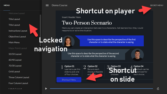
Create a shortcut button. I usually put a button in one of the corners that gives me quick access to slides. Sometimes, the button just skips the slide. I may do that if it has longer narration or animations. Other times, I may add a link to a menu area where I have access to all of the slides.
- During production, I keep it visible so I remember it’s there or can easily direct reviewers to it.
- After production, I either delete it or hide it by making it transparent or use a hotspot. It is nice always having access to it once the course is live.
- Put the button on the master slide so it’s available on all the slides that use the layout.
Create a menu tab on the player. The benefit of a player tab is that the link to the shortcuts is available regardless of the slide and layouts. It’s ever present. And then when you’re ready to publish, just disable the player tab.
- Create a slide with menu links. I usually create a separate scene and make sure it’s not visible in the player menu.
- Insert a custom player tab and link to the secret menu slide.
- Hide the player tab when the course is published.
One of the benefits of this over the slide master is that the slide master sits on the bottom. It’s possible that the slide content is on top of the button and not available on a given slide.
Click here to view demo course.
Above is a demo course where you can see both options in action. I locked the sidebar navigation and each slide is locked for five seconds. The first three slides don’t have access to the onscreen shortcut button.
Create Quick Access to Variables
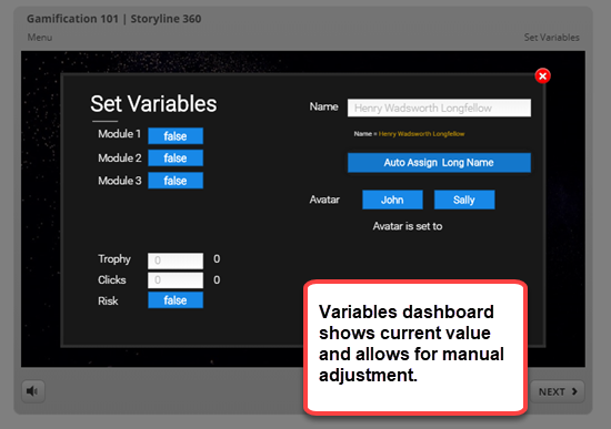
In a recent post, I showed how to do something similar with variables. Instead of going through an entire interaction (or course) to see if the variables are working properly, create access to a variables dashboard. There you can assign custom values to the variables for testing and to see if everything is working as it should.
Click here to view variables demo.
Having quick access to specific slides or be able to jump to certain places in the course is a big time-saver when reviewing the course.
I’m curious how many course designers do something similar and what you do to create shortcuts.
Download the fully revised, free 63-page ebook: The Insider’s Guide to Becoming a Rapid E-Learning Pro
Upcoming E-Learning Events
Coming to Australia and New Zealand.
- We’re doing two different tours. The same workshop but in five different cities: Sydney, Auckland, and Christchurch in 2019 with Brisbane and Melbourne in early 2020. Choose the one closest to you. Details below.
- July 24 & 25 (Minneapolis). Articulate Roadshow: Learn more and register here.
- August 14 & 15 (Seattle). Articulate Roadshow: Learn more and register here.
- September 9 & 10 (Sydney). Articulate Roadshow: Learn more and register here.
- September 12 & 13 (Auckland). Articulate Roadshow: Learn more and register here.
- September 16 & 17 (Christchurch). Articulate Roadshow: Learn more and register here.
- November 4 (Manchester, UK). Articulate Roadshow: Learn more and register here (early bird ends October 4).
- November 5 & 6 (London, UK). Articulate Roadshow: Learn more and register here (early bird ends October 4).
- November 8 (Edinburgh, UK). Articulate Roadshow. Details coming soon.
2020
- April 20 & 21 (Brisbane). Articulate Roadshow: Learn more and register here.
- April 23 & 24 (Melbourne). Articulate Roadshow: Learn more and register here.
Free E-Learning Resources
 |
 |
 |
|
Want to learn more? Check out these articles and free resources in the community. |
Here’s a great job board for elearning, instructional design, and training jobs |
Participate in the weekly elearning challenges to sharpen your skills |
 |
 |
 |
|
Get your free PowerPoint templates and free graphics & stock images. |
Lots of cool elearning examples to check out |
Getting Started? This elearning 101 series and the free e-books will help. |


