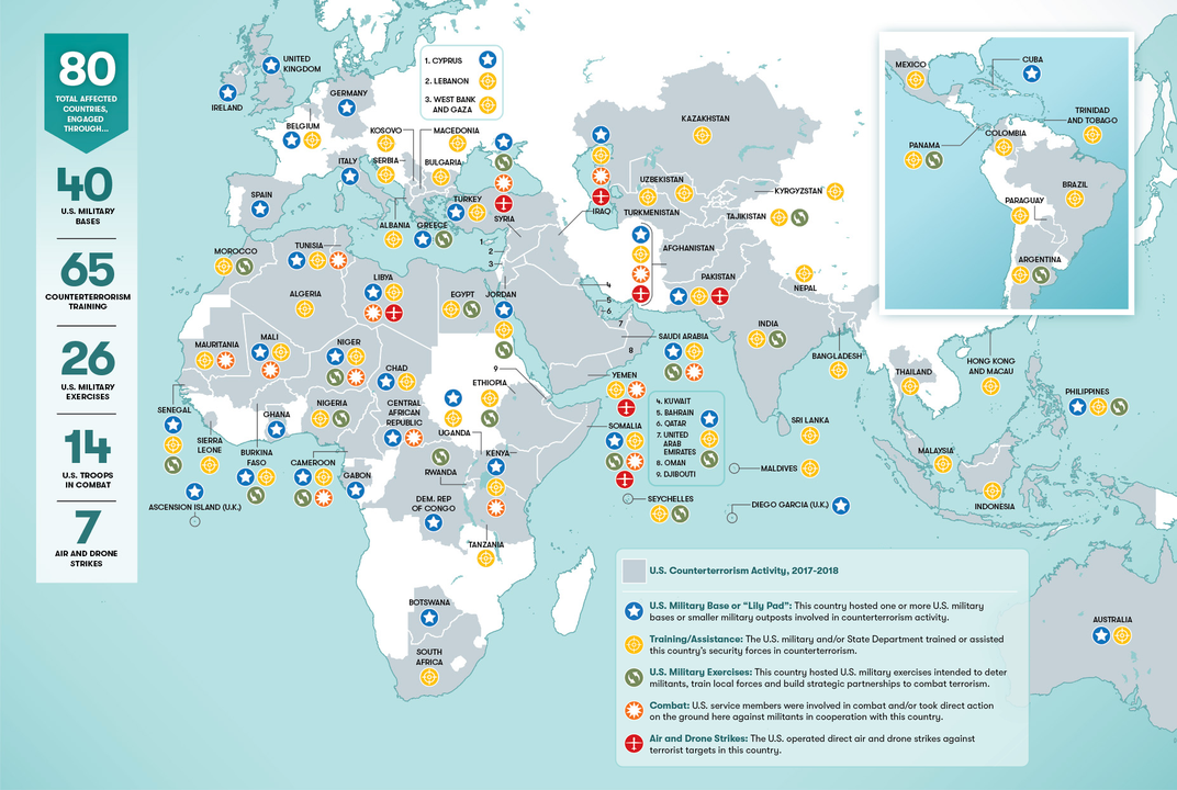
America at War: Infographic Reveals How the U.S. Military Is Operating in 40% of the World’s Nations
Author: Josh Jones
Go to Source

Earlier this month, NBC reporter and analyst William Arkin ended a 30-year career as a journalist, announcing in a “scathing letter,” Democracy Now! reports, that “he would be leaving the network. Arkin accuses “the media of warmongering while ignoring the, quote, ‘creeping fascism of homeland security.’” He does not equivocate in a follow-up interview with Amy Goodman. “The generals and the national security leadership” are also now, he says, “the commentators and the analysts who populate the news media” (Arkin himself is a former Army intelligence officer).
The problem isn’t only NBC, in his estimation, and it isn’t only supposed journalists cheerleading for war. Most of the conflicts the country is currently engaged in are un- or under-reported in major sources. His letter “applies to all of the mainstream networks, applies to CNN and Fox, as well…. We’ve just become so shallow that we’re not really able even to see the truth, which is that we’re at war right now in nine countries around the world where we’re bombing, and we hardly report any of it on a day-to-day basis.”
This isn’t the case with independent media organizations like Democracy Now!, The Intercept, or Airwars. Secular and religious refugee relief organizations like the International Rescue Committee, World Relief, or Muslim Global Relief are paying attention. Many of these organizations are non-U.S.-based or connected to the “civilian experts” Arkin says once appeared regularly in the national media and represented opposing views, “people who might be university professors or activists… or experts who were associated with think tanks.”
Airwars, affiliated with the Department of Media and Communications at Goldsmiths, University of London, has monitored conflicts around the world since 2014, with extensive coverage and records of alleged civilian deaths, military reports, and the names of victims. For a comparable U.S.-focused deep dive, see the Costs of War Project at Brown University’s Watson Institute of International & Public Affairs. The project’s website not only tracks the enormous economic costs of wars in the Middle East and Africa since 9/11; it also tracks “the human toll,” as you can see in the video below.
At the top of the post, see a map (view in a larger format here) from the Cost of War Project’s Stephanie Savell, 5W Infographics, and the Smithsonian of all the regions where the U.S. is “combatting terrorism.” While most of the media orgs and non-profits mentioned above would probably dispute the use of that term in some or all of the conflict zones, Savell sticks with the official language to describe the situation—one in which the nation “is now operating in 40 percent of the world’s nations,” as she writes at Smithsonian.com.
Maybe no one needs an editorial to imagine the enormous toll this level of military engagement has taken over the course of 17 years since the inception of the “Global War on Terror.” The map covers the past two, illustrating “80 countries, engaged through 40 U.S. military bases,” and conducting training, exercises, active combat, and air and drone strikes on six continents. The selections, writes Savell, are “conservative,” and sourced from both independent and mainstream media outlets and international government and military sources.
“The most comprehensive depiction in civilian circles of U.S. military and government antiterrorist actions overseas,” the America at War map provides information we don’t often get in our daily—or hourly, or by-the-minute—diet of news. “Contrary to what most Americans believe, the war on terror is not winding down.” It is expanding. Given the country’s history of sustained mass movements against legally suspect, grossly expensive wars with high civilian casualties, disease epidemics, starvation, and refugee crises, one would think that a sizable segment of the population would want to know what their country’s military and civilian defense contractors are doing around the world.
via Smithsonian.com
Related Content:
Josh Jones is a writer and musician based in Durham, NC. Follow him at @jdmagness
America at War: Infographic Reveals How the U.S. Military Is Operating in 40% of the World’s Nations is a post from: Open Culture. Follow us on Facebook, Twitter, and Google Plus, or get our Daily Email. And don’t miss our big collections of Free Online Courses, Free Online Movies, Free eBooks, Free Audio Books, Free Foreign Language Lessons, and MOOCs.

