Product Review – Percipio by Skillsoft
Author: Craig Weiss
Go to Source
It might be a surprise to some folks who only know of Degreed, EdCast and Learn Amp, that there are quite a few LEP/LXPs on the market, which offer quite a bang for your budget.
One of these platforms is Percipio by Skillsoft. The platform is still in the “potential phase”, but that doesn’t mean you should hold off, if you are considering it, especially if you are debating between it and say, Linkedin Learning. Because, between these two, the winner by far is Percipio.
Good
- I’d actually say great with the Chrome Extension of Percipio, where you can search by highlighting any word or words on the internet back into the platform.
- Analytics including “Program Value” – shows the ROI in terms of metrics that you can show
- User Interface as a whole – on the learner side, layout is simple, easy to figure out – to a point.
- Content includes audio books, audio summaries, book summaries. Content also includes courses, videos, practice labs and links to your own content.
- Ability to brand, add logo, do quite a bit on your own – Easy too – No developer skills needed
- Certifications are doable from big name vendors such as Amazon, Google, Cisco, Microsoft and more
- Easy to “Add to Playlist” or “Remove from Playlist”
- Mobile app – I love that you can read, watch and listen offline – huge wins for audio books and books in general (ebook format)
- Practice Labs also in the content options
- Accepts CMI-5 content (although there isn’t a lot out there, still.it is like having 4K programming before everyone else jumps on board and offers it)
Average
- Channels and Playlists – Standards in the LEP/LXP market, hence just listed here. I will say though that the Channel view, once you select the content listed in “Channel” is far superior than the other content views – that you find in the playlist or standalone.
- Share Link – I debated about listing this in poor, because I still see zero value in this – other vendors do it too, and I see zero value in that as well. Who are you sharing this with? I mean unless they have the platform, the share value is well, zero.
- Admin side – Solid, but not wow. Except for the ROI metrics
- Assignments – Personally, I am not a fan of assignments in an LEP/LXP. The whole point of these platforms are learner-centric approach – allow me to pick by my interests and learn. You can’t say that, and then enable folks to be assigned items of learning or training. Once you do, then are you still an LEP/LXP?
- If you are into the assignments angle, then having it on the main page highly visible is a win for you. Me? Not really. Plus, on the metrics side there is way too many metrics for assignments. Thus, if you are not having your folks complete assignments or you are not doing assignments (and thank you for that), then these metrics are worthless. I surmise there were some clients who wanted assignments, because the reliance and level of items tied to it, are extremely high.
- Watch, Read, Listen – As options for narrowing down playlists, channels for the content you want by each option. I love the icons though, easy to figure out.
- 3rd party content is available within the platform, they continue to sign up vendors – so that is a plus
Poor
- End user content can only be viewed via a Link (will change in 2019). Percipio is not the only vendor that does this in the space, but where they are now, they should have made the changeover. Thankfully, they will.
- Same issue with 3rd party content – right now if you have 3rd party content yourself and want to take it in Percipio, you must connect via a link. Percipio though can accept AICC, SCORM, xAPI and CMI-5 (win!).
- Culling i.e. removing outdated content and/or updating isn’t really there. I saw a lot of bad and outdated content, especially with the “courses”. Again, they are not the only LEP/LXP that has this issue (most do), and it is tough when you are pulling it from other providers, but still if it is your own..
The Details.. The Details
The first time you log into Percipio you will see a screen asking you to identify and select your areas of interest. You can pick as many as you want. After you select the topics/areas of interest, the next screen helps you narrow it further down with sub-categories. When you are finished, you click the button and now your home screen will populate with those areas listed as either playlists and/or channels.
Home Screen (Your main learner page)

Resume Learning is the first item you will see, along with “My Assignments” – if you have any that is. If not, it won’t appear.
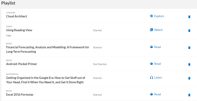
The second row is “My Playlist” which is your own playlist, and you can constantly add more content to that playlist as you see fit.
The rows after that are the playlists of the content based on your topic of interest/interests. You can always edit the interests at any time.
My Playlist
The order of items regardless whether they are in my Playlist or in the interest playlists or channel playlists (i.e. why one title is first, the other is second and so forth) is completely random. In other words, it is not based on the number of times it was viewed, nor how popular or unpopular it is. Nor is it based on format of the content or anything else that I could think of, but anyway, that is how it works.

This view is far superior to the “View All” view, which trust me, should be modified

To me, the better design route to go with the “View All” is the view you see when you select a “Channel” and wish to view it in more detail. For Example, I selected the channel “Cloud Architect – which is to be certification channel:

Granted this is showing different chapters if you will, but with a Playlist view all, this would definitely be a better look, than the text drab of the “View All” screen under the whatever topic of interest playlist.
What I can do in My Playlist

a. Take the content. Here is where it gets a bit funky. You can select whatever content you want, and in the content (depending on what you select) you will either see it by chapters-pages or by chapters. That is great and the way it should be, but for “courses” and “videos” – which by the way are on in the same on the platform, it is more of mini videos contained in the “video” and mini courses err videos in the “course”. Thus, you might see a course which is 1hr 41min, and made up of 14 videos, and when you click you see the chapters which are actually those mini videos.

I did like the bookmark option , whereas you can start to view a chapter (i.e. mini video) stop it at wherever, then jump around and pick another chapter and go in. You can leave for days, weeks, etc. when you go back to that chapter it will remember where you are and you start from that point. That is fantastic and something that is a must.
However, there are no bookmark points in the video, i.e. where I can just see the points I left and return, rather it is a straight video play that you see. Nor can I pause the video in my content bar view. To pause, I have to go to the video itself and click the pause on the video bar.
In the chapters you can “Remove from Playlist or Add to Playlist”, but this is a bit misleading. When I saw this, I thought to myself, hey I have zero interest in improving my accountability, so let me “remove it from my playlist”, but in reality it doesn’t, that is because remove from my playlist is the entire course itself. Now think about this, if I am viewing the various mini videos within that course, why remove the entire course, rather than say that one video.
If you select “Video” content than the mini chapters you select from will start with an intro screen from Skillsoft, rather than jumping right into the content. This only appears once if you go “Course” which equally is made up of mini videos.
Another issue, is that it isn’t to get back to the home page of the dashboard. The only way I can do it, is by clicking the name of organization or logo – in my trial, it would be Percipio. There should be though a “home button or a home icon” which I can click – something that most end user would recognize quickly as the way back home.
![]()
One other item to note is that in the audio book view, you see the chapters but if you select one, you see only the total duration of the entire audio book, and not the specific chapter.

I will say this, and repeat it, if you want to listen to the audio book, use the mobile app. The same with the ebook – listed as book. Because otherwise, you will want to punch your laptop or desktop screen.
Regardless of the content you select, you will always see Content-Overview in the side view. Depending though on the content you might see additional resources. In the case of my “course”, I saw a course transcript, which wait for it, is a transcript of the video which shows up in a new tab.
It would be nice to have a mini overview – highlight if you will in the playlists – but again, it is rare to find in the LEP/LXP space, so I totally understand why it isn’t in Percipio either – but nothing like taking the lead on it!

All-Watch-Read-Listen

Depending on the playlist and the content contained within, you might (most likely) will see options to filter down to a specific format. In my playlist for Microsoft Office, I saw “Watch and Read”. In others, I had the All-Watch-Read-Listen, which tells me there are audio books and/or audio summaries, books and/or book summaries along with videos.
Filtering was easy. What though became confusion was again getting back to the nomenclature of how Skillsoft defines a course. As noted multiple times, every course was in fact a video (specifically a series of mini videos under that topic). The only time you get a really interactive and engaging content, where you as the learner can actually interact and do things is under “practice lab”.
Thus either add a new section for interactive content (which people will know means interactive) or call it Scenario-Based Courses or scenario-based, and have that as an icon.
Because Watch implies video and since Percipio has content stated as video, I think folks would assume that a course maybe is in another format besides video, which in Percipio it is not.
Practice Labs sounds like it is only available for software, which is why the term should be put to bed. Scenarios or interactive learning or even saying Simulations or Sims – people know this is interactive and they can do stuff within it, rather than just sit there and watch.
Which you know isn’t really engaging.
As mentioned earlier, adding or removing from a playlist is very easy
- Click
 which when you hover over it says “more actions”
 - Add to Playlist or Copy Link

If you wish to remove from the playlist, you accomplish this in the next view after you click on the content. Ideally, you could remove it from the same initial more actions on the main home screen.
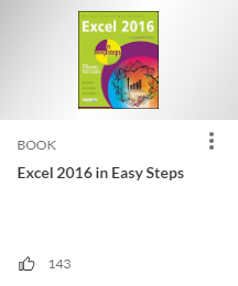
If you like the content you click the “thumbs up” icon that is similar to Facebook. You cannot dislike the content though, nor can you leave comments on the content itself.

There is not a “views” number either which end users and others like. Personally, view only tells me clicked on the content piece, not whether or not you actually went into it the chapters or read some of it or whatever. Thus views are misleading. But from the consumer perspective folks like it, so I have mixed feelings on whether to list it. That said on the back-end of the administrator view, “views” doesn’t really tell me anything so there from an analytical data perspective, I’d not have it as an “overall views”.
Library
Very easy to use and you can drill down to see breakouts. It also shows Certifications as an option too.

Easy. A plus in my book.
Administration View
There is quite a lot that an administrator can do with Percipio. As mentioned earlier, you can add your own logo, branding and so forth. In this example, I removed the name of the entity, so that is why you see black in some areas.
The options in the administrator area include
- Dashboards
- Reports
- Users
- Assignments
- Content
- Licenses
- Settings
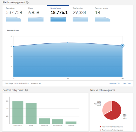
Under the dashboard setting is where to me the real power of the analytical data exists. There is a lot to like here, but there are some enhancements needed.

Page views is a typical metric you see in any LEP/LXP. You also see it in many LMSs and I cannot see any value in this, because it tells me what exactly? Nothing. It doesn’t tell me where the end user went in that page or viewing of content. It doesn’t tell me how long they spent in that page or piece of content or where they went or how many times, etc. If I want to identify what types of content by subject that I may need to add or purchase (via other content providers available in the system), this data point of total page views won’t help me. Thus for all those folks who use LEP/LXP as skill building and developing skills, hard to identify a skill gap with overall page views.
Content entry points is a start, but again, I want to get granular here. And the Activity metric sort of does it.. but SORT is the big ticket here

This is a nice first step, but to really make it worthwhile, go more granular. I want to know what Unique Titles were selected – how long in each title, where did they go, how often, how many times and so forth. While you can do that in a report, it would be nice at a graphical level to show that.
Two other dashboards that caught my eye were
ROI metrics
- Program Value
- Alignment to Business – aka KPIs

I prefer the term alignment to business, because it really is utilizing the philosophy of Impact of Learning whereas it is tied to the business or business series of objectives and goals. Which does present metrics in an non-subjective manner.
That said, because Percipio relies so heavily on assignments the business alignment gets lost. An LEP/LXP is pushed as learner-driven, not admin-driven nor client-driven, so when you do assignments you are really pushing out “required learning”.
Since LEP/LXPs target L&D (and not folks in training per se), and the reason behind an LEP/LXP was that folks in L&D (as a whole) were/are using an LMS for required and compliance training, and thus wanted to offer personal and professional development skills (as learner-driven) in a way they are not using it in the LMS (even though they can).
So there is a flaw in the logic here, at least to me. Clearly the folks who wanted this – I assume it was from some clients initially, was a misstep on Skillsoft’s part. Look plenty of vendors rely heavily on the client feedback, but this is why, it is never a good idea to just embrace without saying the words, “no” or here is why we are not. Trust me, you can say it, just use the words, “that is on our roadmap”, the standard saying in the tech world. : )
Anyway, the whole assignment issue is as you can see a real irritant to me, and a big concern that LEP/LXPs as a whole will add it as a function. Most folks who buy an LEP/LXP buy it as an add-on, and not as a standalone. My vibe with the assignment angle is to have more folks go standalone. Still…
Program Value
Simply rocks.

Every LEP/LXP and LMS and every learning system out there, should have at least some form of this metric – you can add quite a bit more too. This is something every person in training and L&D and even HR could use and really a huge KUDOS for Percipio to offer it.
Reports available in Percipio
- Learner Activity – provides metrics on learner engagement with content
- Assignments – details what content has been assigned to learners
- Assignment Summary – displays summary information on all assignments
- Entitlements – listing of users who have consumed a license
- Content Access – details what content users in your organization are accessing
- User Listing – displays a full listing of all users and their attributes
- User Summary – provides high level statistics on each user
- Audience Summary – displays data on all of the audiences
- Collections – lists available content by collection including description and attributes
- Executive – provides summary data for site and content engagement
Chrome Extension
Percipio isn’t the only vendor who offers a Chrome Extension, but what makes theirs different than others is the way it works. After adding the extension, which can be found in the Chrome Extensions store, it appears in on your browser toolbar.
Once you click it, it will popup with a window asking you to add your site link and then you log-in. The reason for this is when you are searching the net and find something of interest whereas you can see if it exists in Percipio, you can “search” quickly.


The extension stays active, even when you are not “using Percipio” so you can always highlight a word or a series of words and see if – the topic – or any words tied to it – exists in your Percipio system.
I really like that.
Mobile app
I always tell people to see when the app was last updated. Believe it or not, a lot of vendors’ mobile apps are outdated or worse, buggy.
Percipio’s mobile app was updated on the 18th of December and includes now the ability to access offline (big win with the audiobooks and ebooks especially) and the use of voice commands to access videos and audio books.
You can synch back to the platform too, when you reconnect to the net.
All wins.
Bottom Line
Percipio by Skillsoft continues to impress as they move forward with new functionality and capabilities. While there are areas that need enhancements and tweaks, and some areas that left me wondering why, overall it is on the right path.
Especially when it comes to things that matter most – for learners the content, ease of use, flexibility and options; and for the administrator – data.
Oh, and for the L&D and training execs, the metrics of Impact of Learning with a touch of ROI tossed in for good measure.
Note: Percipio by Skillsoft can be found in findanlms.com, so you can compare them against others such as Degreed and EdCast (by functionality, etc.) You can also schedule a demo with them in FindAnLMS and send them an RFP.
E-Learning 24/7


