The Easiest Way to Add Visual Context to Your E-Learning Course
Author:
Go to Source

When it comes to the visual design of you course, there’s on thing you can do to add context. And it doesn’t require a graphics design degree.
Replace the bland default template with a single background image. Find the one image that best establishes the context of the course. Once you have an image, there are things you can do.
Here are a few simple tips.
Determine the Course Context
I like to focus on industry. And then within an industry you may have specific environments like meeting rooms and offices. A corporate business course will have a different image than one on training medical staff. What single image quickly establishes context?

Keep the Design Simple
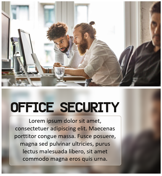
Images communicate a lot of information. You want context without a lot of distraction. This is especially true when the background image contains people. We tend to look towards the face. If you do find an image to be distracting, you could add a blur to it (or other design element). This shows the visual context but with the applied blur effect the person is drawn to the course content and not distracted by decorative elements in the image.

You Need Placeholders for Course Content
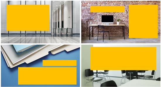
If you’re using a single image, you need to consider where the content goes. I like to look for images with obvious content spaces. That means less for me to edit or design. A common one is the file folder. It looks business-y and it gives me a place to put content.
The images below have good empty areas that can hold the course content.

Vary the Imagery
Since you’ll be working over a series of screens, try to find more than one image that meets the context requirements. You can use the different images to establish different types of content or sections. If you can’t find images that look like they came from the same place, you can add color filters or other effects to make them seem more cohesive and as if the belong together.
In the example below, the images were from different sources. But the visual context (fire department) and the color overlay tie them together.

The tips above don’t replace solid graphic design. But it does help the person who has limited time or skills step away from the default layouts that may be a bit bland. And it helps make those screens visually rich and contextual.
Download the fully revised, free 63-page ebook: The Insider’s Guide to Becoming a Rapid E-Learning Pro
Upcoming E-Learning Events
April 20 & 21(Brisbane). Postponed until September. Details coming soon. Articulate Roadshow: Learn more and register here.April 23 & 24(Melbourne). Postponed until September. Details coming soon. Articulate Roadshow: Learn more and register here.- November 9 &10 (London). Details coming soon.
Free E-Learning Resources
 |
 |
 |
|
Want to learn more? Check out these articles and free resources in the community. |
Here’s a great job board for elearning, instructional design, and training jobs |
Participate in the weekly elearning challenges to sharpen your skills |
 |
 |
 |
|
Get your free PowerPoint templates and free graphics & stock images. |
Lots of cool elearning examples to check out |
Getting Started? This elearning 101 series and the free e-books will help. |
