Three Things to Do Before Building Your E-Learning Course
Author:
Go to Source

Here are three time-saving tips to consider before building your e-learning course.
Determine the Story Size
Many e-learning courses are 4:3 aspect ratio. The other common aspect ratio is 16:9. However, you’re not confined to either one of those aspect ratios. What if you want something more like a book? Or perhaps square?
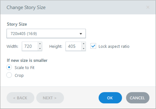
Determine the story size and resolution before you start working on the course.
What we often see is that someone opens the e-learning software and starts working on the course using the default settings. And then somewhere in the process wants to change the size and resolution of the course. This can be problematic because when you modify the aspect ratio of the slide, it means the existing content may get skewed or require a bunch of tweaking to get it re-aligned. Thus you want to determine the course’s aspect ratio before adding content to the slides.
Choose a Template Before Building the Course
Another common process is that the course author starts to build content and then later wants to apply a template. However, templates are made up of specific layouts and theme elements. If the content the author builds doesn’t start mapped to a layout and the theme features, applying a new template to it somewhere in the process can cause issues and require a lot of extra work.
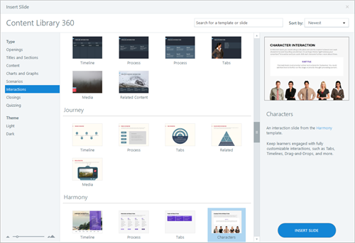
The point of a template is to guide the design and speed up production.
Before you start working on the course, curate your content and then pick a template appropriate to the context of your course and the type of content it has. From there, add your content to the template and then make some simple modifications to the theme colors and fonts. Choosing the template first will definitely save time.
Set the Theme Colors and Fonts
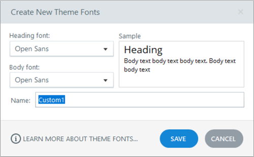
Generally, most e-learning courses have two core fonts: headers and body. You really don’t need 8 million fonts in your course, two is usually fine. On top of that, many fonts are part of a font family with different variations so you could get by with one font family. Then just determine which font is used and when.
After choosing your fonts, set one as the header font in your theme and one as the body. This way if you want to apply a different theme you can do that easily. If you don’t use the theme fonts it requires slide-by-slide editing to make changes.
The same thing can be said about theme colors. Determine the colors you want to use in your course and then set those colors in your theme. This way every object you insert will have the same theme colors. And like the fonts, can be swapped instantly.
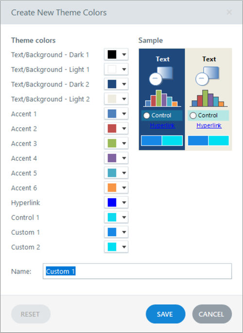
When you create theme colors, remain consistent in how you use them, You get six accent colors. There’s no rhyme or reason to how they should be used. They’re just six color options. However, I like to use accent 1 as my main color. And I use accent 2 (and sometimes accent 3) as complimentary colors. I don’t use all six colors so I don’t worry about coming up with six colors to fill out the accent color options.
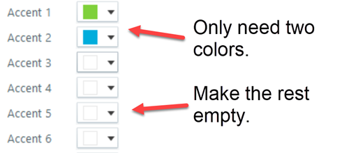
The main point is that regardless of how you use accent colors options, be consistent in how they’re used. This makes it easy to swap the theme colors.
Do those three things above before you invest time building out the content. It will save you a lot of production time. And it forces you to be a bit more intentional in how you are building your courses.
Do you have any other quick production tips before starting the course construction?
Download the fully revised, free 63-page ebook: The Insider’s Guide to Becoming a Rapid E-Learning Pro
Upcoming E-Learning Events
Coming to Australia and New Zealand.
- We’re doing two different tours. The same workshop but in five different cities: Sydney, Auckland, and Christchurch in 2019 with Brisbane and Melbourne in early 2020. Choose the one closest to you. Details below.
- September 9 & 10 (Sydney). Articulate Roadshow: Learn more and register here.
- September 12 & 13 (Auckland). Articulate Roadshow: Learn more and register here.
- September 16 & 17 (Christchurch). Articulate Roadshow: Learn more and register here.
- November 4 (Manchester, UK). Articulate Roadshow: Learn more and register here (early bird ends October 4).
- November 5 & 6 (London, UK). Articulate Roadshow: Learn more and register here (early bird ends October 4).
- November 8 (Edinburgh, UK). Articulate Roadshow. Details coming soon.
2020
- April 20 & 21 (Brisbane). Articulate Roadshow: Learn more and register here.
- April 23 & 24 (Melbourne). Articulate Roadshow: Learn more and register here.
Free E-Learning Resources
 |
 |
 |
|
Want to learn more? Check out these articles and free resources in the community. |
Here’s a great job board for elearning, instructional design, and training jobs |
Participate in the weekly elearning challenges to sharpen your skills |
 |
 |
 |
|
Get your free PowerPoint templates and free graphics & stock images. |
Lots of cool elearning examples to check out |
Getting Started? This elearning 101 series and the free e-books will help. |
